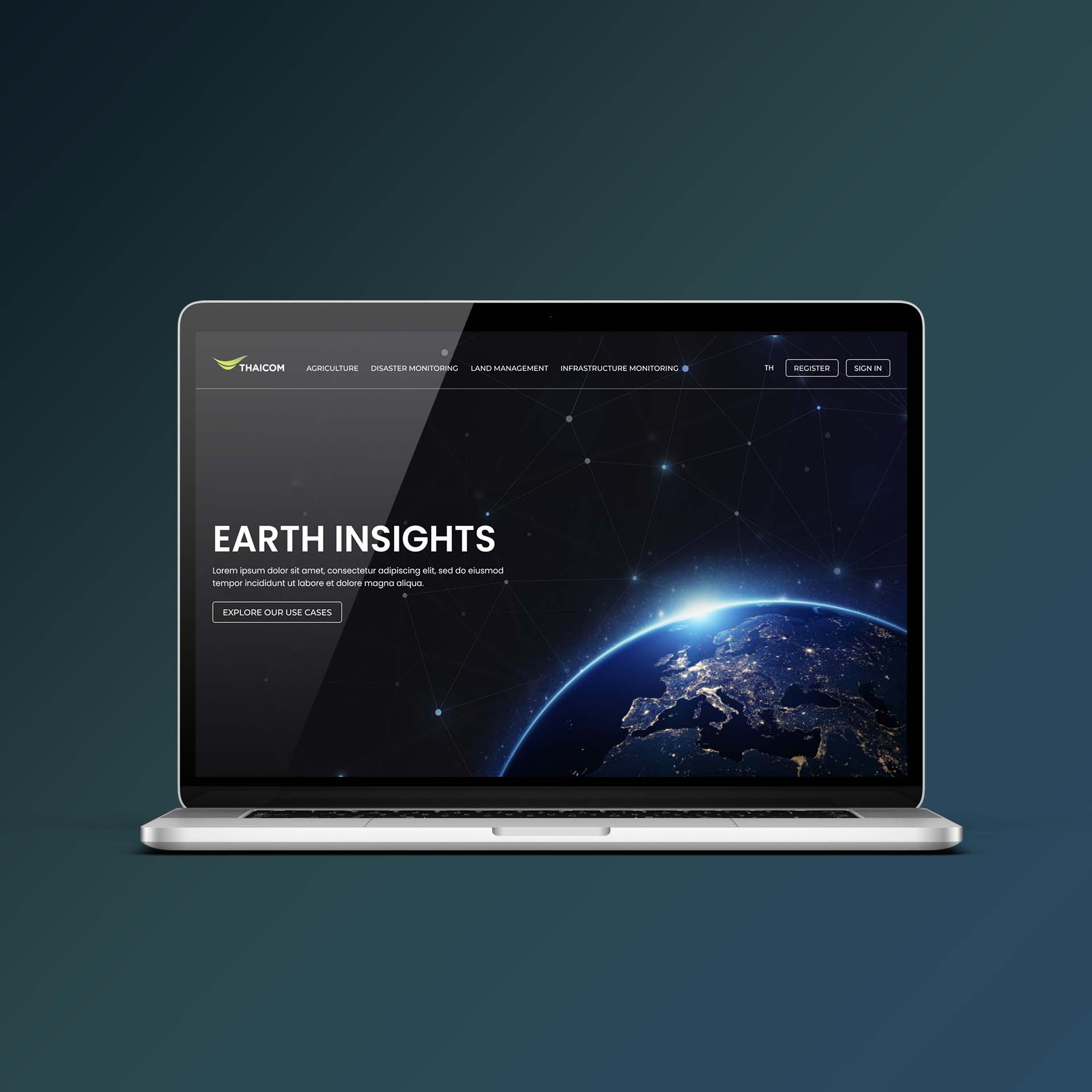
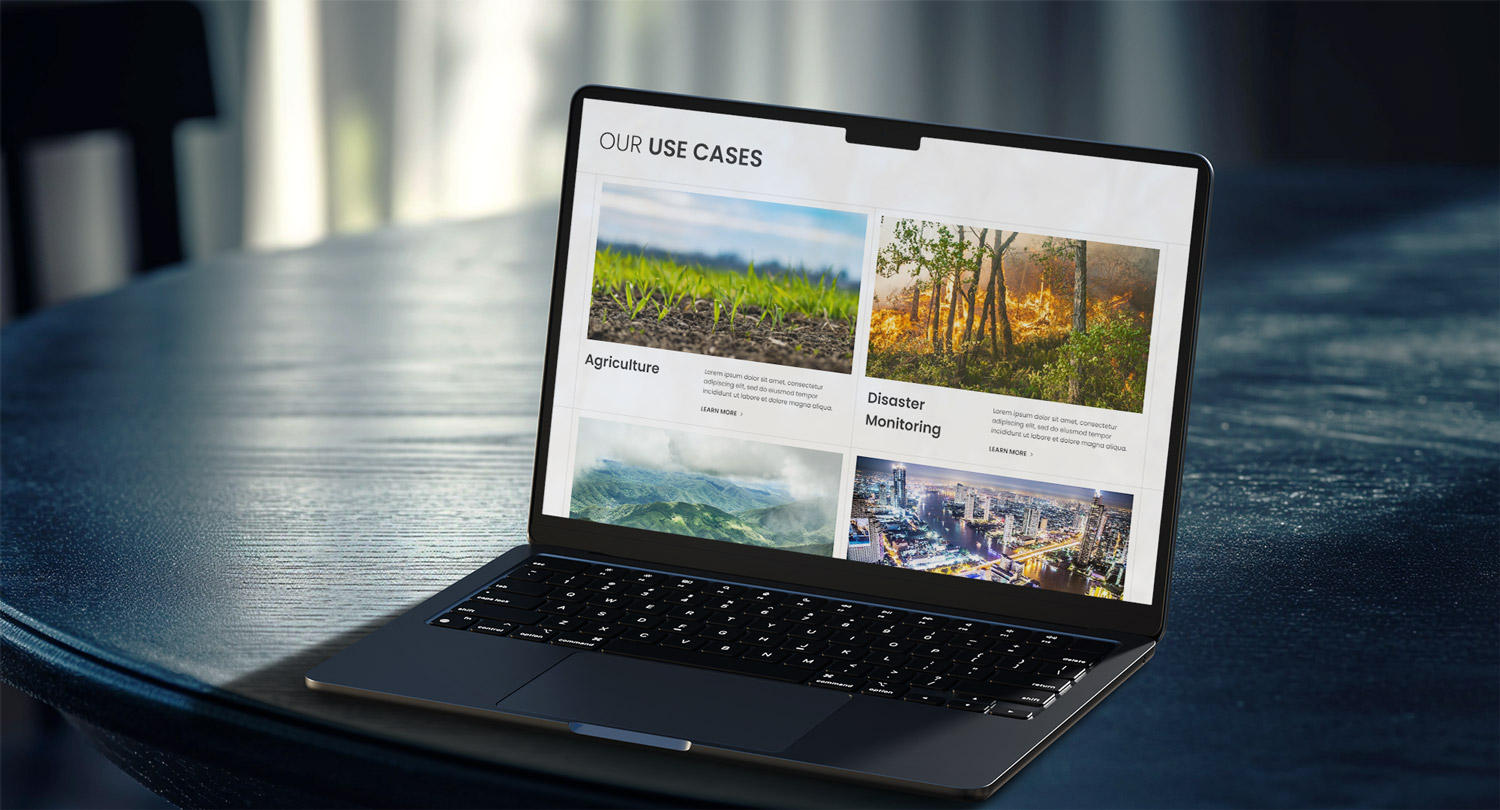
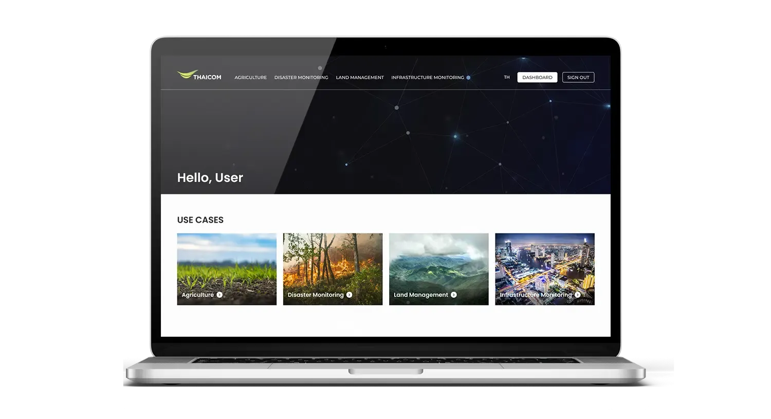
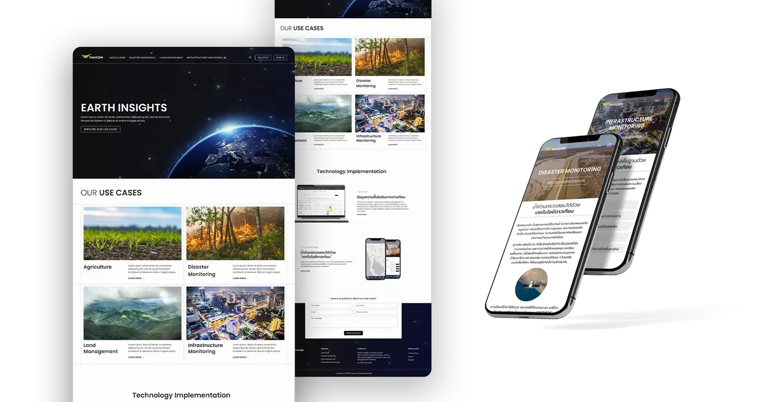
Thaicom builds satellite technology; we designed the interfaces that put it in people's hands. This case study walks through our UI/UX design process for their satellite applications, from mapping what operators need to see to the finished screens that make dense capabilities feel straightforward.
Thaicom builds satellite technology, and they needed a web platform that shows what it can do — how those satellite capabilities solve real problems across different industries, not just what the hardware is. The audience is enterprise, so the interface had to meet enterprise software standards: clean, professional, credible.
The harder part was the material itself. Satellite technology is dense and abstract, and the brief was to make it legible — to turn technical capability into screens a non-specialist can read and a decision-maker can trust.
We designed a responsive platform in Figma around Thaicom's satellite use cases, holding to enterprise software standards throughout: a clean, professional interface that reads as credible to the technical buyers and partners it's aimed at.
Abstract technology needs pictures. We created custom product illustrations, hero images and infographics to explain what satellites do and where, so the capabilities land visually instead of getting lost in paragraphs of specification.
We organised dense technical content into a cohesive visual system with a clear hierarchy — walking a reader from "what is this" to "how it solves my problem" — so the platform communicates satellite capability rather than just listing it.
Thaicom came away with a platform that makes complex satellite technology approachable: a clean, enterprise-grade interface, custom graphics that carry the concepts, and content structured so real-world use cases across industries are easy to follow. It's the foundation of our ongoing UI/UX work with Thaicom, including the crop-health and forest-carbon applications elsewhere in this portfolio.